Data Journalism: Six books to read

Data Journalism: Six books to read
There many great tutorials online for data-journalists. But especially for beginners, a printed book might be the best way to build initial skills. Here are six recommendations, for starters and practitioners alike.
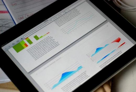
Photo: Brian Suda, all rights reserved
When learning something new we know that these rules apply: Do it slowly, but steadily - from the first awkward step to running full speed. Do not expect too much in the first phase, be patient and persistent.
Starters need know-how in a variety of fields
Data-Journalism is something that needs to be learned and trained. Not because it is so awfully complex, but because there are several bodies of knowledge that need to be connected and understood: Knowing to tell stories, to search for data, how to refine the data and finally visualize what you found and publish it.
This is why the five books below are very helpful. They all have great content, covering different angles of know-how to get you started. Plus, they have a practical angle, so much of what you will learn can which can be easily be transferred into productive projects of your own quite quickly.
1. The Data-Journalism Handbook
This is the most practical book to understand what makes visualization easy to understand and correct in terms of sizes, axis legends and all the little parts that should be right. Plus: It is a book for people who want to learn. There is a short introduction, then in the main part, Donna M. Wong shows what is usually done wrong when charting and how it should be done. Work with this book for one or two focused days and you will gain much, much knowledge how to create charts, including line charts, multiple line charts, bar charts and pie charts. There is a section on “tricky“situations too.
If you feel you are not a graphic design pro and want to get a quick, easy to understand and correct overview, this is for you.
4. Andrew Dilnot, Michael Blastland: The Tiger that Isn't
Journalists often misread numbers, tend to blow up a trend and like to speculate about future events based on some numbers. More often than not the claims made are embarrassingly wrong.
This is why "data literacy“ or "number literacy“ are important. Instead of snickering at data, every practitioner of data-journalism should be on guard when seeing a new dataset. Sometimes a surprising story is hidden in a spreadsheet, at other times the quality of the data published by some official institution is so bad, that this is the story to publish. This is what "The Tiger that Isn‘t“ is about. It lists up examples, shows why extrapolating a trend from today into the future is often false. P.S.: When shopping for this book, do not be confused by two different titles from the same authors. The book here was published in 2007, later it was re-published for the US with changed examples under the title "The Numbers Game“. If you are European, buy "The Tiger that isn‘t“.
5. Brian Suda, Designing with Data
Why is that relevant for data-journalism? There are several reasons: The editor working with the data needs to be the "director“ of a data project. If she or he is not, has no idea of the later outcome and a limited understanding of why some data projects are complex and others are not, there is a high risk that the data project takes much longer and will eventually be left unfinished.
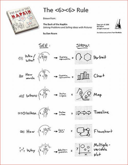
The book teaches you visually thinking, using simple and quick visualization techniques. All you need is a pen, a piece of paper and 10-20 minutes of focus. With the techniques shown in this book everyone can scribble along very fast, firstly answering basic journalistic questions like what, when, where, why and how. We use it in data-journalism trainings all the time. A sample of the process can be found here.


